The Daily Grind
Brief: Create branding for a coffee brand that stands out on the shelves, is bright and colourful and has a lot of character.
01
Traditional coffee branding
Customers often have preconceived notions of what a coffee branding should look like. Familiarity in design can create a sense of comfort and trust. Hence, coffee shops may stick to traditional design elements such as classic colours like browns and greens to meet customer expectations.
Coffee, being a beverage deeply rooted in tradition and heritage, often adheres to certain visual cues associated with its origins. Brown hues signify warmth, earthiness, and the natural colour of coffee beans. Green represents freshness, sustainability, and the origins of coffee cultivation. These colours have become ingrained in coffee shop designs as they evoke a sense of authenticity and familiarity.
02
Something Different
Bright colours are known to evoke emotions such as happiness, energy, and positivity. Associating these colours with this coffee brand can create an instant emotional connection with consumers, making them feel uplifted and enthusiastic about starting their day with the coffee.
From all coffee brands on the shelves that often rely on earthy tones like browns and greens, a vibrant and colourful brand can easily catch the eye and stand out from competitors. It becomes memorable and distinct in the minds of consumers, drawing attention and curiosity.
Bright colours can convey the energetic and vibrant qualities of the coffee. By associating brightness with this brand, it’s aligning it with the essence of coffee itself - a drink meant to wake people up and energize them.
Colours can influence consumer behaviour and perception. Bright and vibrant colours can subconsciously communicate freshness, quality, and a more modern approach.
03
The Design
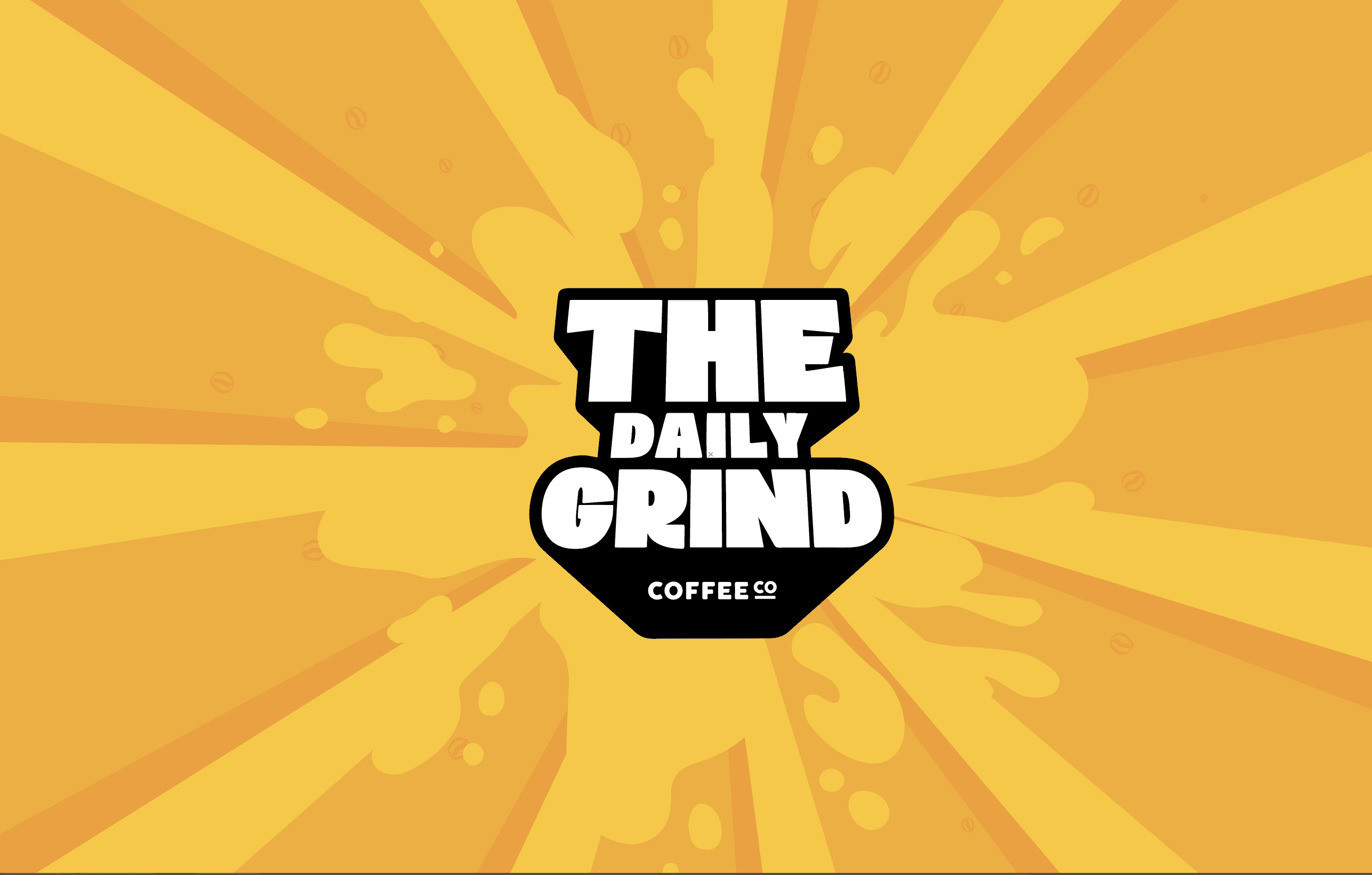
For the logo, I wanted to create a wordmark that was bold and recognizable and would go with a lot of different designs. I decided to make a 3d effect to the letters using illustrators 3d menu to add dimension to the words.
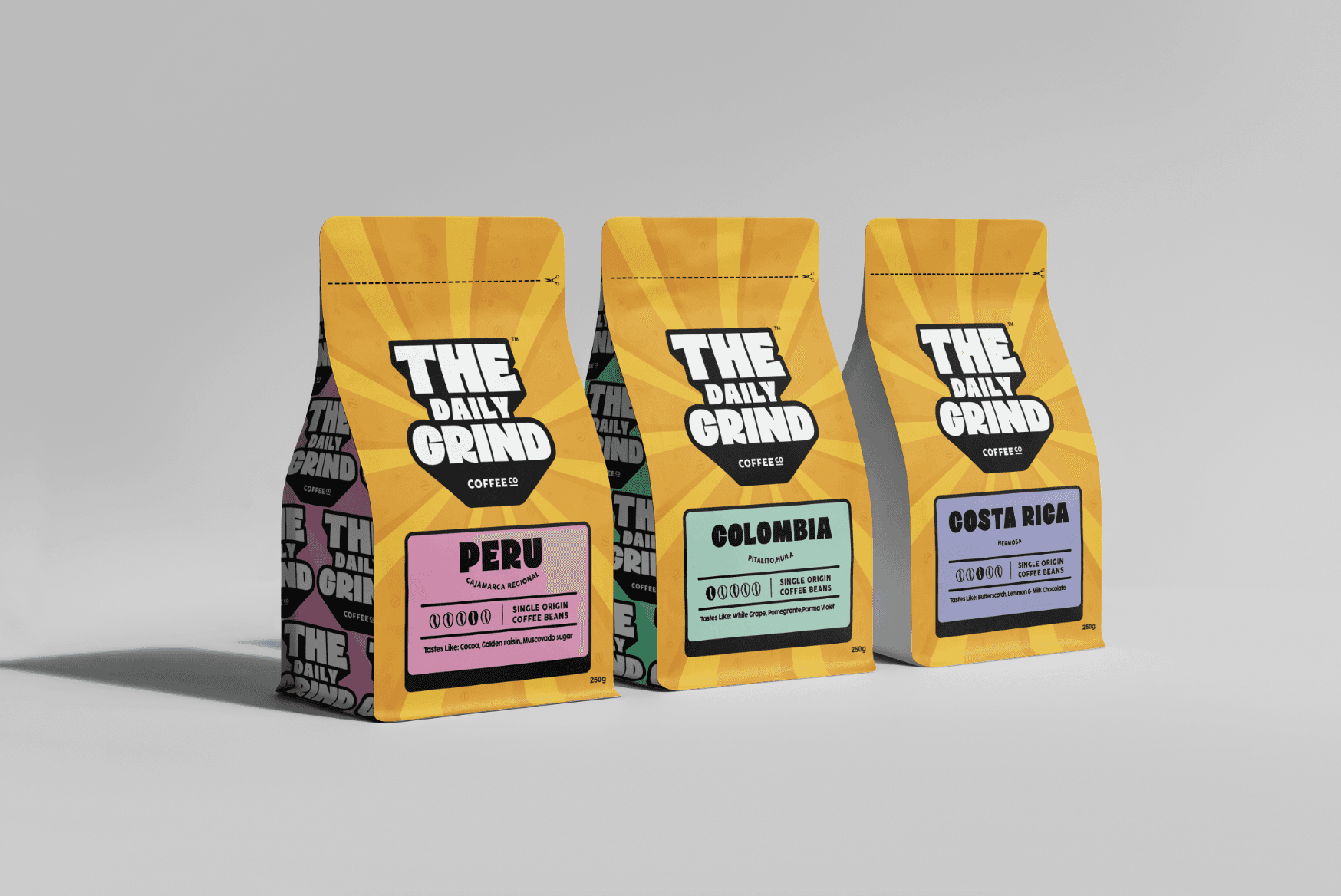
For the final design of the packaging, i went with bright yellow sun rays as the background to go with the theme of waking up in the morning. It also adds a lot of bright colour to the design. I feel like the yellows create a fresh feel to the design while also incorporating the element of coffee with the subtle coffee beans in the background.
I’ve used a different colour for each blend of coffee to differentiate them. I used more pastel colours for these as I feel like they complement the yellow a lot more
For the sides of the bag I used the colour from the label so it is recognisable from each side of the bag.
On the back of the package, I’ve added a sticker that says when the beans have been roasted so the consumer knows the freshness of the beans. I’ve also added a sentence to draw people in and give more trust to the brand.
I’ve made the sun rays for the front and back match up at the top so when the package is in your hand it’s seamless
04


