o-wind- dyson creative brief
Brief: Develop a visual identity for the O-wind multi-directional wind turbine, a product designed by O-innovations, including visuals of an online portal and possible brand sponsorships
01
The Solution
We decided to focus on both o-wind and o-innovations to create a versatile visual identity based around the ‘o’ we explored the idea of presenting omnidirectional statically as this would stay consistent throughout the company, and show future innovations. To raise awareness of o-wind, we explored the form of the turbine and how it would interact with urban environments.
02
Logo Design
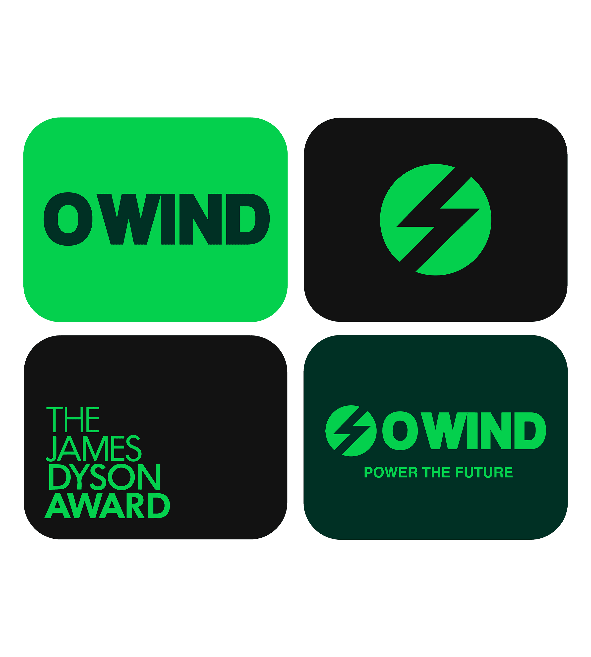
I wanted to incorporate the main features of the wind turbine into the logo;
Energy
Omnidirectional
And the 'o' symbol
The logo has an icon as well as the logomark,consistent thickness throughout icon being slightly bigger than the wordmark as it shows hierarchy, if it was smaller it would look more like ‘oo’ wind. Chose not to have the symbol as the ’o’ in the design as it could be interpreted as just ‘wind’ and as it’s the name of the brand it needed to be clear. The logo has a bolt inside the circle to emulate electricity- the wind part of the name is self-explanatory- having a symbol of electricity makes the logo tell the audience what it is.
03
The Portal Design
For the portal design, I wanted to create a design that fits the boldness and electric feel of the logo as it is an app, it needed to be simple to navigate and work for all audiences as the target audience is the general public the colours used are the brand colours we chose for o-wind. using these colours in the portal design keeps the design and brand consistent so even without the logo it looks ‘o-wind branded. Having a bold first page was important as it told the audience who o wind are. For the content on the o-wind app, we wanted there to be the stats of the turbines to make it more interactive.
04


